
How We Built KMN's Design System: From Chaos to Clarity in 30 Days
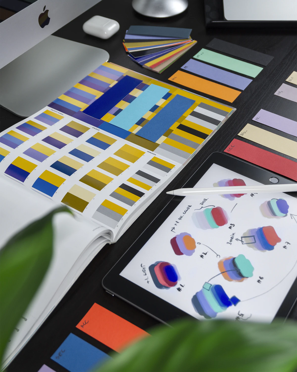
For the first 18 months of KMN Media, our "design system" was a Notion doc called "Brand Stuff" with six screenshots and a colour hex code. Every new client deliverable was an archaeological dig through old Figma files.
The Breaking Point
The breaking point came when we hired our second designer. Onboarding took two weeks — not because of complexity, but because nothing was documented. Button states lived in one file, colour tokens in another, and the icon library was scattered across three Figma drafts.
A design system is documentation that runs. It's not just a Figma library — it's a shared understanding of how the brand thinks.
What We Built
Foundation Layer
Colour tokens (not hex values), typography scale (8 levels with a 1.25 ratio), spacing system (8px base grid), elevation system (5 levels of shadow). All defined as Figma variables, not static values.
Component Library
We started with 12 components used in every project: Button (5 variants), Input, Card, Badge, Avatar, Tooltip, Modal, Dropdown, Navigation, Footer, Tag, and Divider. Each component has a documented API — what props it accepts, what states it has, and when to use it.
Pattern Library
Patterns are compositions of components — Hero section, Pricing table, Testimonial grid, Blog card, CTA block. Patterns are the real productivity multiplier. A designer can drop in a "Pricing — 3 column" pattern and be done in five minutes.
The Results
New designer onboarding: 2 weeks → 3 days. Time to first deliverable: 5 days → 2 days. Client revision cycles: 3.2 average → 1.8 average. Design consistency score (our internal audit): 62% → 94%.
The system paid for itself in the first project after launch. We've since open-sourced the Figma template — link in the footer.